Exhibition documentation
1
During the summer holidays, we were asked to visit exhibitions. I chose to go to one called 'Tradition Interrupted' at the Katonah Museum of Art in New York. In this exhibition, there were photograph/art pieces by Dinh Q Le, a Vietnamese American multimedia artist.
I was very interested by his work, and it reminded me of my work during the structure project because of the weaving. I think it was fascinating that he was able to tell his own story through these pictures, which were part of a wider series called 'photographing the thread of memory'. I think that the juxtaposition displayed here is quite powerful and thought-provoking.
2
I also visited the Musee Rodin in Paris, where a large collection of Auguste Rodin's works including his paintings and sculptures were on show as well as some art by Vincent Van Gogh and Monet. Auguste Rodin was a French sculptor and portraitist, who began creating art in 1858. This was very interesting to see. I found it incredible how the sculptures were so intricate and realistic and the paintings so detailed. There was also an exhibition within the gallery with some photographs which were very interesting as well. My favourite piece would probably be 'The Thinker', seen in the first image below. The sculpture depicts a man leaning over, appearing to be contemplating, as Rodin wanted to portray him as 'a damned soul, and a free-thinking man, determined to transcend his suffering through poetry.'. It was sculpted out of bronze, and Rodin had intended for it to be commissioned for a set of bronze doors for a museum in Paris.


3
In October, I went to Frieze Art Fair in London. This show is one of the biggest, and so there were many pieces of contemporary art, sculptures and photography on display. Seeing all of this was very interesting, as I saw the diversity and variety of styles and techniques different artists use. I was really intrigued by how each piece can be interpreted in so many ways.


Word 1 - CONTRAST
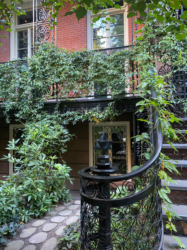
The word 'contrast' is defined as the state of being strikingly different from something else in juxtaposition or close association. My interpretation of this word is many things, for example old vs new, natural vs manmade and urban vs rural. For my upcoming project, I want to capture these kinds of themes, to portray the theme of contrast.
My work


My favourites
These are my favourites because the juxtaposition of the leaves and the black metal railings/concrete is quite harsh, but the leaves have been integrated and grow around them which I think makes it look interesting, and whilst showing contrast they also create a sense of unity as the plants weave together and their growth adapts to the manmade environment.
|

|
Evaluation: I was able to photograph things that fit my theme and display a contrast of natural vs manmade structures, which was my intention. On the other hand, I think that for some of them I needed to pay more attention to my composition and quality of the images. Furthermore, in my next shoot I will take more pictures.
Word 2 - DISCONNECTED
Philippe Hugonnard
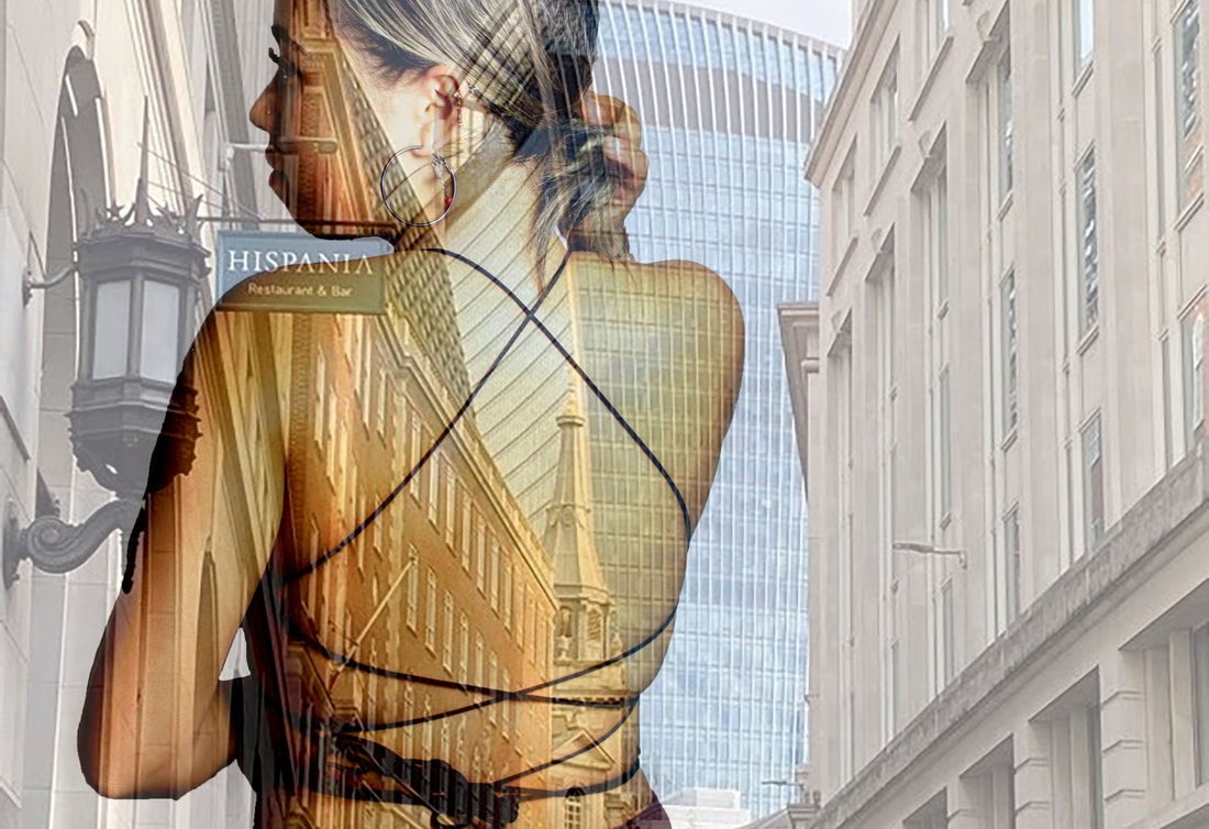
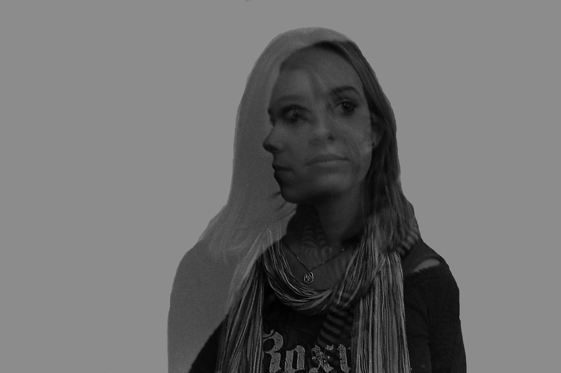
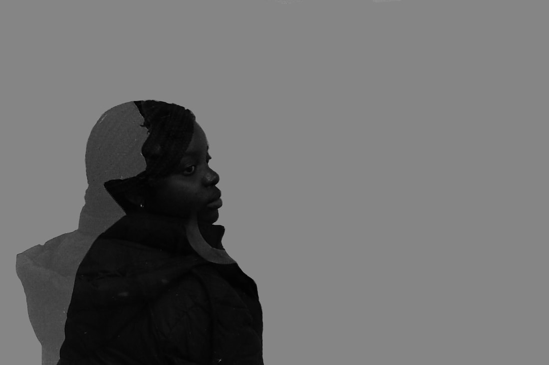
Philippe Hugonnard is a Paris-based photographer, born in Geneva, Switzerland. He mixes several digital media to manipulate photos which draw the viewer's eye. He likes to investigate the dynamics of landscapes and he aims to reduce the world’s complexity into simple forms. He does this to convey a mood that changes the final impression of the image and present an imaginative element. Furthermore, he tries to exaggerate and emphasise architecture. This is seen in his series 'Another Look', where he uses selective colour to make certain things stand out in a black and white background. I was inspired by his work as I thought that this style was very interesting and effective.
His work


I think that this fits with my theme of 'Disconnected' as the parts with colour can be seen as disconnected from the black and white surroundings.
My work
method
To create the edits seen below, this was the method. Firstly, I opened up the unedited picture in Photoshop, and locked this layer. I then duplicated the layer, and turned the top (duplicated) layer black and white. With the black and white layer selected, I used the eraser tool to rub out sections of the image, revealing a pop of colour underneath. Once I was happy with them, I saved them by selecting Layer -> flatten image, which made them into one layer, savable in a .jpg format.


To create the edits displayed above, I began with a full-colour picture. I opened it onto Photoshop and pressed duplicate layer. Once this was done, I turned the top layer black and white. Using the eraser tool, I then erased the areas I wanted to turn colourful and carefully outlined them and filled them in.
Evaluation: I think that the result of my images is similar to the work of Philippe Hugonnard, and I was happy with them. The pictures I had taken were suitable as they had bold colours that I was able to make pop out. Furthermore, I really enjoyed the editing of them.
Word 3 - FAST-PACED CITY
I chose the phrase 'fast-paced city' as my next word to respond to. This linked to some of my work in the structure topic. In order to respond to this, my aim is to represent the speed a busy city within a still image. To do so, I took long exposures, which effectively show many frames in one, which I think would link well to my theme.
My work


To create these images, I stood on a rooftop terrace nearby a junction. I experimented with my shutter speed and shot as the cars went by, turning it up and down to see which looked the most effective. My aim was to capture the movement and dynamics of the city, in order to convey the idea of the theme 'Fast-paced city' and the light tunnels are effective at doing this I think as they depict a lot of movement.
EVALUATION: I am happy with the outcome of my images. I think that they show the fast pace of the city well, especially because they are so dramatic and for the longest exposure, the junction just looks like a light beam. It was also fun to experiment with my camera settings. In future projects like this, I would definitely consider using a tripod to minimise movement and keep the lights more straight, as with these long exposures, even a slight movement can change the whole image.
EVALUATION: I am happy with the outcome of my images. I think that they show the fast pace of the city well, especially because they are so dramatic and for the longest exposure, the junction just looks like a light beam. It was also fun to experiment with my camera settings. In future projects like this, I would definitely consider using a tripod to minimise movement and keep the lights more straight, as with these long exposures, even a slight movement can change the whole image.
Edits
Below are some edits of those pictures, as they were too overexposed, so I turned down the exposure, and adjusted the brightness and contrast:


Disconnected - Development 1
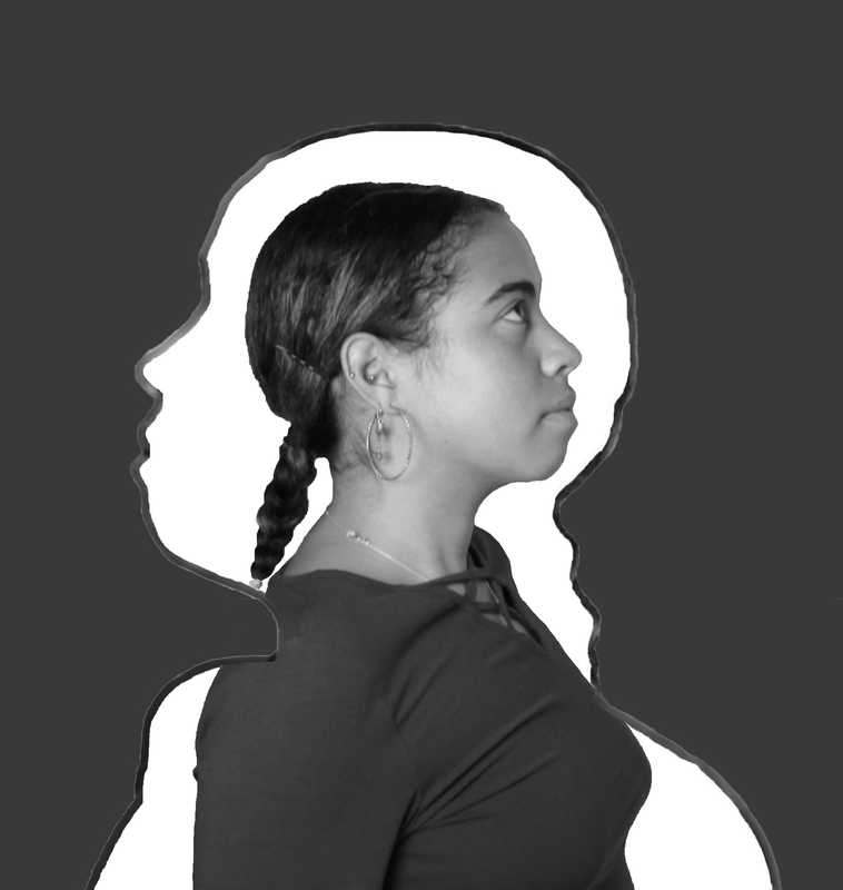
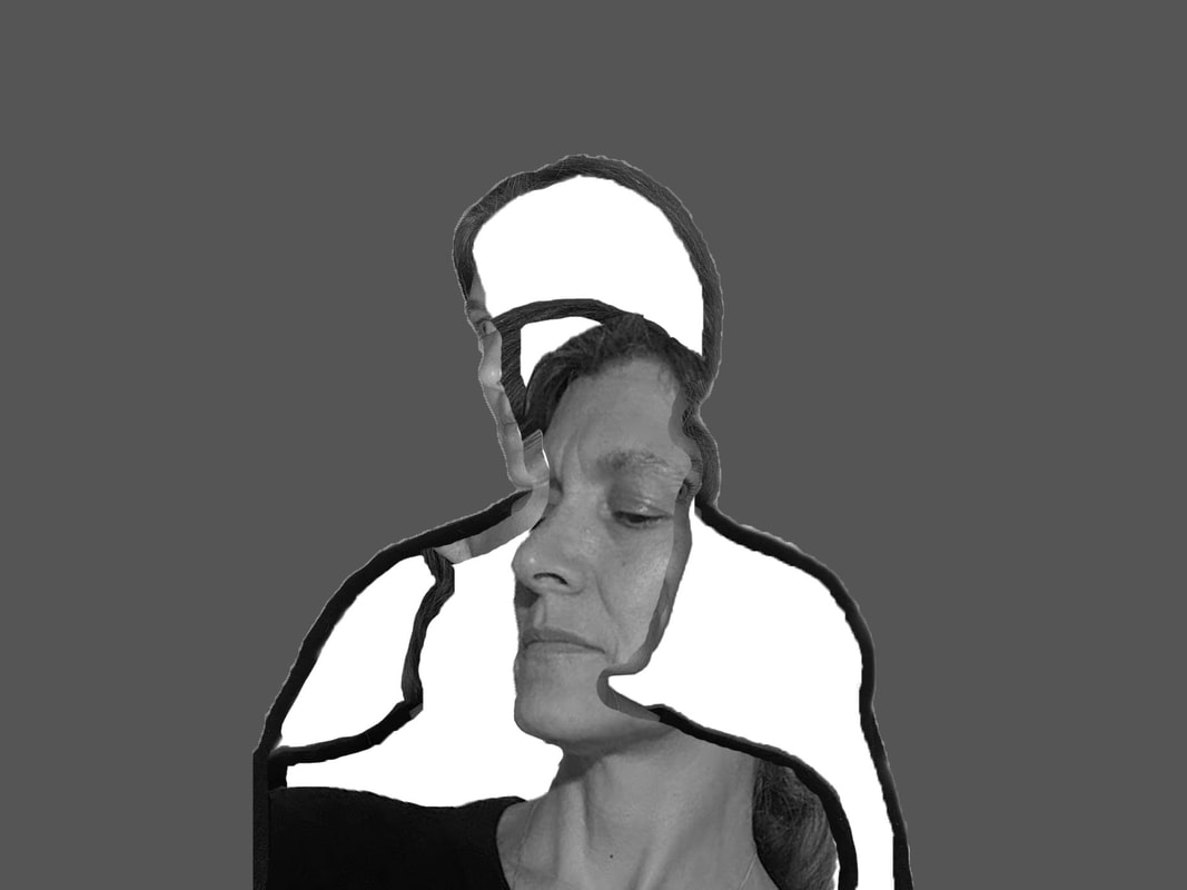
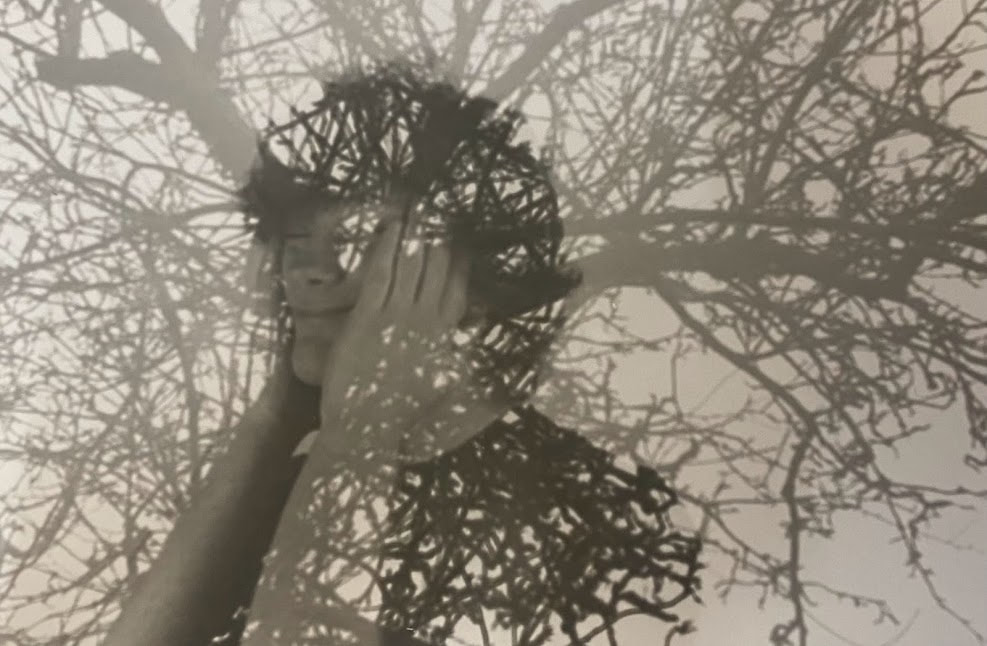
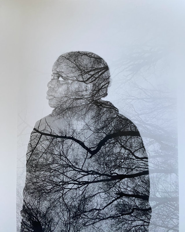
My favourite strand and the one I want to develop is 'Disconnected'. I liked responding to this word as there are lots of ways to interpret the word, and thinking of ways of doing this was fun to do. To develop this strand further, I intend to create a double exposure. With this I think it will fit the theme as I plan to have two contrasting images together in one image, so whilst they are not connected, they are together.
Christoffer Relander
For inspiration for this development, I am interested by the work of Christoffer Rolander. He is a Finnish self-taught photographer who is well known for his double/multiple exposures which he creates using just his camera, since 2010. One of his most well-known projects is called 'We Are Nature', which he has worked on from 2010-2020, with a new series each year. The pictures are said to 'blur the line between the natural world and the human form to such a degree that it is impossible to tell where one ends and the other begins.' He was inspired to make these as he wanted to show the juxtaposition between man and nature, and the beauty of the Finnish countryside that he grew up in. In an interview he explained that his photographing methods had to change from being shot just on a camera to digital composite because of the pandemic as he couldn't go outside much.
His work


My work

Screen grab the process


EVALUATION: I think that the double exposure effect is interesting, and I enjoyed the process of creating them. I am happy with the overall outcome of them. However, I think I should have used a white background when I created them. Therefore I am going to change this in photoshop. I believe that doing this will make my pictures more similar to the work of Christoffer Rolander.


With a white background, I think these edits do look better. Not only do they look more like Christoffer Rolander's work, they stand out more which I think looks interesting.
Development 2
For my next development, I am going to experiment more with the double exposure effect, but this time doing it with cityscapes rather than nature. I will be taking inspiration from the work of Jasper James.
Jasper James is a British photographer with 25+ years of experience, working for top companies. Photography inspired him to experience and see the world in a new light. He spent nearly a decade living and photographing in Asia, but he has also previously lived in New York and London. He enjoys travel, portraits and concept-driven photography. These areas combine in his 'City Silhouettes' series, in which he uses multiple exposures to mix portraits with birds-eye views of the city. These photos add a personal perspective to the impersonal cityscapes. He described a visit Tokyo, in 2006, when he thought of it: "When I first got high up, the scale of the city was awe-inspiring,". He began experimenting with his camera, a Mamiya RB67, which could switch between taking Polaroids and film. This let him experiment with different exposures until he found the right combination of a person's silhouette and the city.
Jasper James is a British photographer with 25+ years of experience, working for top companies. Photography inspired him to experience and see the world in a new light. He spent nearly a decade living and photographing in Asia, but he has also previously lived in New York and London. He enjoys travel, portraits and concept-driven photography. These areas combine in his 'City Silhouettes' series, in which he uses multiple exposures to mix portraits with birds-eye views of the city. These photos add a personal perspective to the impersonal cityscapes. He described a visit Tokyo, in 2006, when he thought of it: "When I first got high up, the scale of the city was awe-inspiring,". He began experimenting with his camera, a Mamiya RB67, which could switch between taking Polaroids and film. This let him experiment with different exposures until he found the right combination of a person's silhouette and the city.
His work


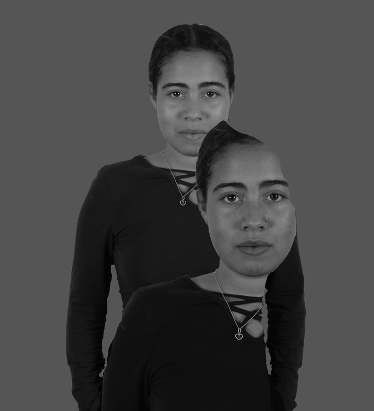
I think that this concept is really interesting because it is like it is showing two sides to the city. I think that this fits my theme of disconnected well as it is like the city is disconnected from itself and the people in the portraits are disconnected from their identity in a way.
My shoot
Here are the contact sheets from my shoot of cityscapes, which I took in Bank:


|

|
Evaluation: I am quite happy with the outcome of my edits. I think it looks interesting because the image inside the portrait looks like it is disconnected from the surrounding pictures as not only is it separated by being inside another image, but it almost looks like the images inside were taken somewhere else, especially in edits 2 where there is a contrast between the modern bus with an advertisement inside the portrait, with the old-looking fancy arch. However, I think next time I should choose a location that is more representative of the person in the picture as I hadn't considered this before the shoot. Although this could also link to the disconnected theme. In addition, I think my pictures could have been closer to the work of Jasper James if I had made the portraits look more like silhouettes, so if I recreate it in the future I'd try to do this more.
Development 3

To develop this idea further, I turned it into a GIF. To do this, I used the same portrait, but with different, yet similar backgrounds. In photoshop, I opened both of these images and opened 'timeline' in the window section. I then selected 'create frame animation'. Then I converted my two images as animation frames and set the GIF to loop forever. I thought it was going too quickly at 0.03, 0.1 and 0.2 seconds after experimenting, so then I decided on 0.5 seconds.
Evaluation: I think that this GIF is interesting, and something different to what I have done in the past, so I enjoyed making it. Overall, I am happy with it. However, next time I would try to keep the portrait more in the same place, which is something I found to be a challenge here.
Evaluation: I think that this GIF is interesting, and something different to what I have done in the past, so I enjoyed making it. Overall, I am happy with it. However, next time I would try to keep the portrait more in the same place, which is something I found to be a challenge here.
I did another shoot, to make another GIF, this time considering the location of my shoot's significance with my model. I decided to photograph my mum, with a building that has significance to her. This is a building on Carburton Street that she used to work as a journalist in when it used to be the ABC news building. This is also where she met my dad, as they both worked there. Therefore, it is a very significant and special place to her and her identity. Below is the GIF that I made by combining her portrait with two images of the building, as well as the process behind making the images for it.

Evaluation: I am happy with this GIF, more so than the previous one. I was able to keep the portrait completely still in the middle, with the background image changing. Also, the image has more meaning, so I think it is more powerful. However, the image is perhaps quite dark of the building, and I could have considered my composition better.
Cinemagraph - Development 4
For my next development, I plan to create a cinemagraph. To do this, I will be videoing things that are significant to my model - my mum.
The process:
After shooting both portraits and short video clips, I opened the video by going into photoshop and selecting File->Import->Video Frames To Layers. This opened my clips into individual frames in Photoshop. I then deleted the frames I did not need, leaving me with a short video of around 10-15 frames. I experimented with adjusting the time of each frame on the timeline, and found that 0.2 seconds was ideal.
Then, in another file, I edited my portrait similarly to how I had done in previous developments, with a white background. I then duplicated this layer and sent it to the file with the video.
I put this layer on top of the video layer and added a layer mask, on which I used a black paintbrush tool to erase the part of the picture I wanted the video to appear through, which effectively erased the portrait.
Then, I adjusted the opacity of the portrait to make the video show through more.


Evalaution: I enjoyed the creation of these cinemagraphs. although at first it took me a while to understand the process, after experimenting on photoshop I was able to create products which I was pleased with, and they do move. I am happier with the result of the second image, as the movement is more pronounced, whereas the first image's movement is more subtle.
Pablo Thecuadro - Development 5
Pablo Thecuadro is a Spanish photographer and collage artist. He became interested in photography when he was 12, wanting to capture memories. He wants his collage work to represent the fact that there are layers to our personalities. He uses the negative space in his images to represent the fact that he is introverted and shy, and hides part of himself until he is comfortable with them. As he says, 'The collages I make express the duality in the human being, who we want to be versus who we really are and what part of us we show to others' His collages are made of paper, and are created so that they look like a seamless image. He cuts pictures physically as well as digitally.
His work


My shoot


Edits
Method:
- To create the images below, I opened one image on photoshop. I then used the quick selection tool to highlight the outline of my model. I then pressed Select->Modify->Contract, and selected a number of around 15-25 pixels to contract it by. I then deleted the part of the image that was not selected, which left negative space in the middle, surrounded by the outline of the model.
- Next, I opened the image I wanted to combine with the first image, on top of it. I reduced the opacity of this second layer so that I could see the layer beneath, and I dragged and placed the image to a place where I was happy with it. Using the eraser tool, I removed any parts of the top layer that overlapped with the first layer's outline, so that the second image was only between those lines.
- After returning the opacity to 100%, I applied a black and white filter to my images and selected Layer->Flatten image. Finally, I outlined the whole image, again using the quick selection tool, and around it added a grey background using Edit->Fill.
|
Evaluation: I am happy with the outcome of my images, and I enjoyed the process of making them. I think that they look fairly similar to Pablo Thecuadro's work. However, I think it could have looked better if there was more of a contrast between the images that I combined.
|
Development 6
Whilst I really liked this response, I considered the techniques that Thecuadro himself uses - he does it in real life. Therefore, I created some real-life responses out of paper. To do so, I printed out my pictures and cut them out, arranging them in a similar way to some that Thecuadro has done, and gluing them together, before sticking it on to a white piece of paper as the base/background.


=

I am happy with the outcome of this image/collage. However, it could have looked more like Thecuadro's if I had taken and used more images with differing positions and angles, which I will consider in my next shoot/development.
Nacho Ormaechea - Development 7
To develop this further, I will be looking at the work of Nacho Ormaechea. Ormaechea is a Paris-based graphic designer/photographer. His biggest inspirations are the people surrounding him - their lives, or the lives he creates for them in his imagination. He says that he works with the glimpses he gets of people's complex lives, and he tries to convey different emotions in his work. In his 'Street Memories' project, he makes collages of ordinary people on the street with images or illustrations inside their bodies which he feels represent their mental state. This creates an interesting image which is open to interpretation to the viewer, or as he says, his images will be 'hijacked and read subjectively by every spectator of my work.' prompting them to explore memories. His main intention is to inspires us to create our own stories about the lives of these people.
His work


My work

|
|
After making these edits, and evaluating them, I realised that I could have been more successful if I had shown some of the underneath image more, like Ormachea does in his work. Below are my best edits with this in mind:
Best edits

|
|
Development 8
For my next development, I want to try to make the double exposures inside a film camera.
my shoot
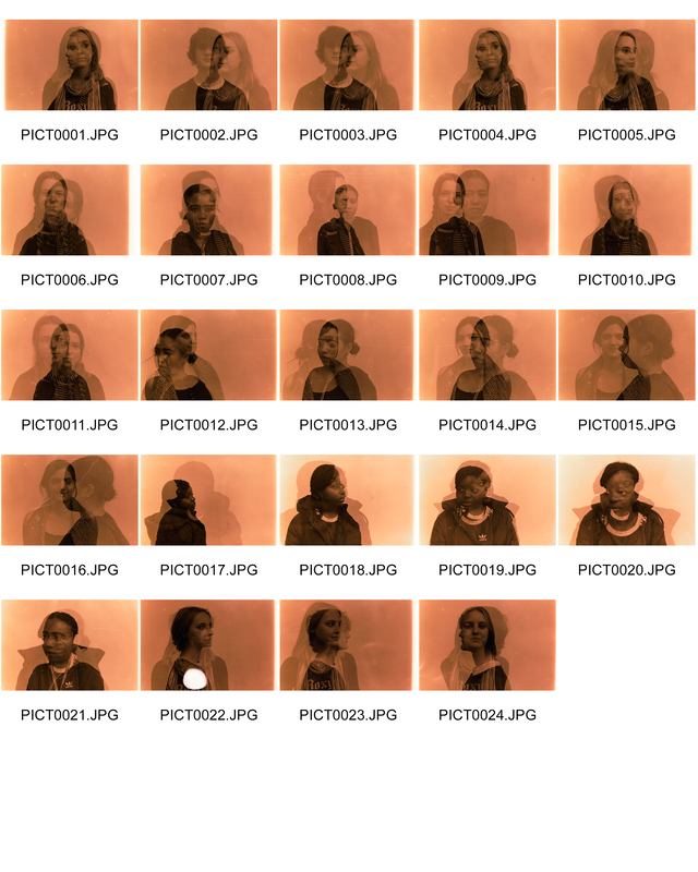
To get these images, I used a film camera to take images of various people in my class facing different directions, etc. After taking 24 images, I reloaded the camera and took another 24 on the same roll of film. After this, I developed the film. Once I had my negatives, I put them into a film scanner, which scanned them onto an SD card. The result of this was my images having an orange tinge, so I edited them in Photoshop to make them black and white:


Edits
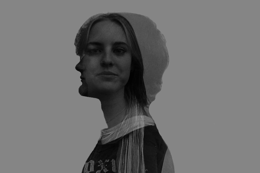
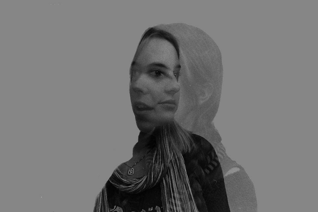
|
|

EVALUATION: I am happy with how the film pictures turned out, and it was fun to experiment with this new technique. I also find that the edits are quite interesting, as it combines the two images more into one, by just showing one person's silhouette. This is an effect similar to the work of the artists I have been responding to throughout the project. However, for my next shoot I would consider requesting that my models wear white to make it stand out more, and potentially not wear accessories. I also think that the images seem to lack contrast.
Development 9 / Final Pieces
For my next development, I plan to use the same technique as previously, but instead of combining two portraits/people, I will combine a portrait with a landscape shot. I will shoot a roll of film of natural landscapes, for example in the woods, and one roll of film of buildings and cityscapes.
Aneta Ivanova
For this development, I want to create work inspired by Aneta Ivanova. She is a 24 year old Bulgarian photographer. Her inspiration to start photography stemmed from her lifelong fascination with art, which as a young child she made by drawing and painting pictures, before discovering photography. She began by doing conceptional work and portraiture, but then started to experiment with different techniques to create meaningful photos - by doing long exposures and multiple exposures of portraits, landscapes and nature. Her inspiration for her photos comes from her interests in reading, walking, listening to music and dreaming. However, her main inspiration is the sea, because she says that 'it is so unpredictable and powerful, always changing, it can heal us at some moments but also has the ability to destroy us in others.'
Her intention is to make work that is as personal as possible, and she mostly shoots self-portraits, or portraits of her sisters, as she feels that nobody else could actually recreate what’s in her mind better. She thinks that artwork should not be explained and giving answers, but asking questions.
Her intention is to make work that is as personal as possible, and she mostly shoots self-portraits, or portraits of her sisters, as she feels that nobody else could actually recreate what’s in her mind better. She thinks that artwork should not be explained and giving answers, but asking questions.
Her work


To respond to Aneta Ivanova, I have taken images on two rolls of film. One of these has pictures that I took in the city - around the area of the Barbican. The other roll of film was pictures of nature. I will then be reloading this film and taking images of people to double expose them. I will then develop the film, before enlarging it in the dark room to make my prints.
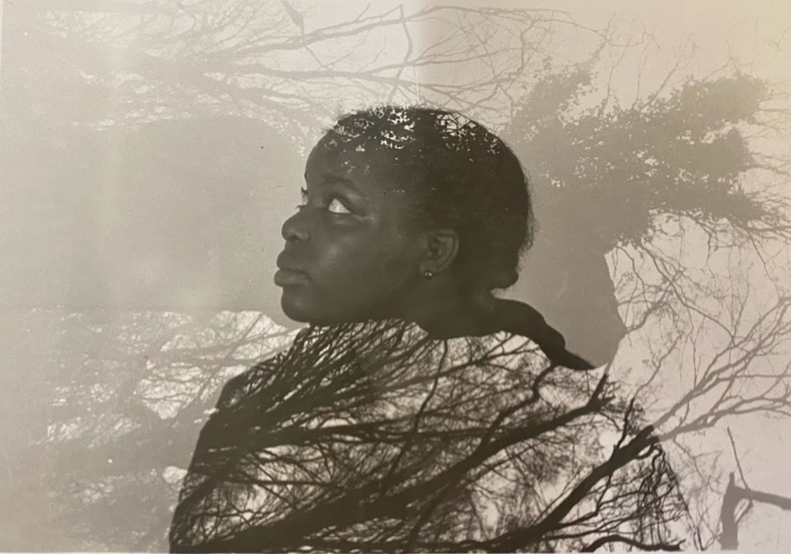
Nature shoot - contact sheet
Here is the contact sheet of my nature/portrait double exposures, which I created by cutting the film into strips of five and placing it in a plastic folder. I then developed this in the dark room. This allowed me to see which images were my favourite to turn into individual prints.

Nature shoot - prints
Seen below are my prints, which I chose because I thought they had the most interesting look. To create them, I selected the row of film that they were on, and placed this in the photo enlarger in the dark room. Once I was happy with the size and focus, I performed test strips for each image to determine the ideal exposure time. After this, I lined the photographic paper up with the image and exposed them to the light, corresponding with the amount of time that the test strip had shown was ideal. I then placed the prints into the chemicals and waited for them to develop. Below are the results of this process:


|
|
EVALUATION: Overall, I am pleased with how the pictures turned out. I was able to create an interesting effect, where the image is only clear inside the portrait, which is the appearance I was aiming for. Furthermore, the experimentation of the darkroom was something I really enjoyed as it is not something that I have done much in the past and it is more technical. However, some of the pictures, especially those in the penultimate and final row of the contact sheet, I was less pleased with. This is because they appear to be blurry and washed out. This was perhaps due to the way I took my pictures or the way I developed them, but next time I will try to prevent this, by ensuring that both my camera and enlarger are in focus.
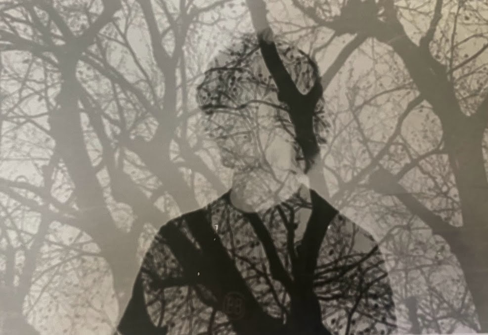
City shoot
My next set of images were created by first taking images on a film camera in the city, around the Barbican/Moorgate area. I then reloaded this roll of film into a film camera and photographed various models - a similar process to the nature shoot.
Prints

|

|

|

|
EVALUATION: I think that the effects in these prints are interesting. The buildings are not as pervasive as the nature shoot, but they are still visible and the technique was successful in creating a double exposure. I do believe that this shoot was not as successful as the previous, however, in terms of looking like I had intended, which would have been for the face to be slightly less visible. Furthermore, they are slightly grainy and could be more clear.
