INTRODUCTION TO THE DSLR CAMERA


The exposure triangle is made up of aperture, shutter speed and ISO. These elements of the camera can be changed to adjust the photograph as it controls the amount of light the lens lets in, therefore they must all be balanced correctly to ensure the desired appearance of a picture.
Aperture is the size of the hole in the lens which allows in light, so adjusting the aperture controls the amount of light hitting the sensor. A large f-stop means there will be a small aperture, and vice versa. To set the aperture, the dial on the camera needs to be turned to AV (aperture priority). This automatically sets shutter speed, but the photographer can manually adjust the aperture/ ISO, which allows them to manipulate depth of field.
-Depth of field is how much of the landscape is in focus, and the distance between the nearest and furthest parts. High depth of field= most of the image is in focus. Low depth of field=foreground in focus, background blurred.
ISO brightens or darkens photos. The higher the ISO, the brighter the photograph, due to an increase in sensitivity in the sensor, and therefore the lower the number the darker the image. This can be set using the ISO button on the camera.
Shutter speed is the length of time that light is let in to the camera. A faster shutter speed lets less light in, which freezes action and results in a less exposed photo. A slower shutter speed results in the opposite, and can create a motion blur effect. To adjust the shutter speed, the dial on the top of the camera must be turned to the TV/S symbol. This setting sets the aperture automatically, and the photographer can set the shutter speed appropriately.
WHITE PAPER TEST
Our first task in the abstraction unit was the 'white paper test'. We were given one piece of plain white paper and the task was to fold, roll and scrunch this paper however we wanted. The aim was to produce over 20 different and unique pictures of the paper. We did this using different lightings and backgrounds to manipulate the appearance of the paper. We also used torches with a coloured piece of plastic to change the colour.
Contact sheets:
My favourite pictures:


I think that I was able to effectively carry out this task because I managed to photograph the piece of paper showing different dimensions, shadows and textures which made it look abstract and interesting. I also used a piece of green plastic and put it over a torch to change the lighting. I think photo 1 looked very effective as you can see the shadow cast behind it and cast on itself. I chose picture 2 as I like the contrasts between colours, and the geometric shapes you can see in it makes it feel more 3D. I also like the 4th picture as it shows a lot of texture, and the dark background makes the green colour stand out more. To improve the look of my pictures, I could have used more lightings and also maybe used a tripod to ensure that the pictures were not blurry. I could also have thought of more different ways to further contort the appearance of the paper to make it more abstract.
Paper development/response
For our next task, we were given 4 different artists' work to choose from to create a response to. The artist I chose was Jaroslav Rossler. Rossler was an avant-garde photographer who combined different styles of modern photography such as: cubism, futurism, constructivism, new objectivity, and abstraction. His photographs often reduced images to elementary lines and shapes, looking at the contrast of light and shade. He experimented with a range of techniques and processes including photograms and double exposures.
HIS WORK:
HIS WORK:


My responses:
Whilst I am happy with how my photographs depict contrast between light and shadow and have shapes, I don't think they are similar enough to the work of Jaroslav Rossler. To improve, I would make the pictures more simplistic and take more pictures from different angles to emphasise the lines and make it more abstract.
Second artist development
After completing our first artist development, the next task was to choose another artist from the list. My choice was Brendan Austin. Austin is a photographer who creates imaginary landscapes out of crumpled pieces of paper. He calls these photographs 'paper mountains', and in these he explores what is meant by nature and the way humans have impacted it. He says that"The isolated desert city running on oil generators, the mars like landscapes of a volcanic environment and the mountains made from paper all attempt to start a conversation concerning the loss of meaning and reality." The resulting images appear both recognisable as landscapes but also suggest a sense of artifice. Humble materials are made to carry an important message.


My responses:


I am happy with the outcome of my response to Brendan Austin's work. I think it was a successful representation. To create them, I crumpled up some coloured tissue paper and placed it on a white piece of paper in shapes to make these landscapes- some have a sharp peak and some are more curved. I think the different textures where the paper is more/less crumpled is effective because it creates shadows and makes it look like a rocky mountain, similar to Brendan Austin's work. Once I had taken the photos I turned them black and white on photoshop and adjusted the contrast.
My edits/ personal development


To create these edits, I inverted the pictures and adjusted the levels on photoshop. I think this made them look even more mountainous as it created a snow-like effect on them. I think it made the textures more prominent as well as there was kore of a light and shadow contrast here. The black background makes the 'mountains' stand out more, almost making them look ominous.
EDWARD WESTON- ORDINARY TO EXTRAORDINARY
Edward Weston was a 20th century photographer who has been named one of the most influential American photographers. His career lasted for 40 years and he photographed many different subjects- including landscapes, still-lives, portraits and nudes. Some of his most famous work was a series of pictures of fruits and vegetables, photographed out of context to capture the 'essence' of them ( 1927-1930). By creating photographs that transformed his subjects into abstractions of shapes and patterns, he helped to bring photography out of the shadow of painting and stand on its own as a credible art form. His manipulation of light emphasises the texture, form and shape of the objects. He took his photos using a Graflux camera which allowed him to view the picture in a screen the same size as he would print it which let him consider the composition more effectively.
In 1932 he became one of the founding members of group f/64, who set their lenses to that aperture to ensure image sharpness of both foreground and distance.
In 1932 he became one of the founding members of group f/64, who set their lenses to that aperture to ensure image sharpness of both foreground and distance.
His work


'Pepper 30':
The first photo ('pepper 30') presented a challenge for Weston at first-due to the aperture he was using- he could only capture a small amount of the pepper in focus due to the small depth of field. As he was up close to the pepper, this meant he had to use an extremely small aperture in order to photograph the whole pepper. To solve this problem, Weston put the aperture at f/240, a 4-6 hours long exposure, and eventually got the image he desired. The light surrounds the pepper, making it look unreal as the sun moved during the 4-6 hours it took, so the light hit every part of the pepper in the photo.
The first photo ('pepper 30') presented a challenge for Weston at first-due to the aperture he was using- he could only capture a small amount of the pepper in focus due to the small depth of field. As he was up close to the pepper, this meant he had to use an extremely small aperture in order to photograph the whole pepper. To solve this problem, Weston put the aperture at f/240, a 4-6 hours long exposure, and eventually got the image he desired. The light surrounds the pepper, making it look unreal as the sun moved during the 4-6 hours it took, so the light hit every part of the pepper in the photo.
My responses:
1. Natural lighting

|

|
My edits
Artificial light
First attempt:
This was my first attempt at the artificial lighting pictures. Whilst I was happy with how some of them turned out, (for example the cabbage because the texture was represented effectively) I found that taking them with my phone torch light didn't pick up as much detail as I wanted, for example on the red pepper, the lighting made the ridges look less defined and more flat, which I was not happy with.
Second attempt:
For my second attempt at the artificial lighting pictures, I used the studio light instead of my torch. I also adjusted my camera settings, and as a result it made the pictures look more defined, and I think I achieved the look I was intending to. In this shoot, the red pepper's shape and ridges were more successfully portrayed in my opinion, and I think the cauliflower looked very interesting and more abstract when I adjusted the position of it.
ABSTRACT COMPARISONS: BODY AND NATURE - Alicja Brodowicz
Alicja Brodowicz is a photographer from Poland. She made a series called 'Visual Exercises' which show comparisons between aspects of nature and the human body - the microcosm and macrocosm, and highlight similarities between shapes, textures and layouts.
Her work:


My response:
In this task, we were required to take pictures inspired by the style of Alicja Brodowicz's work. I took pictures of parts of nature in my garden and then pictures of parts of the body that I found they resembled, and edited them so that they are side-by-side.


EVALUATION: whilst I am happy with the outcome of this task, and I think the photographs resemble each other well, I think I could have taken more pictures and edited them so that they look more similar. I also think it would be effective to have lighter backgrounds like in Brodowicz's work.
ABSTRACT PORTRAITS
Bill Jacobson
Bill Jacobson is a photographer who is most known for his out of focus pictures. He began creating his signature pieces in 1989 in the midst of the AIDS epidemic to evoke the losses brought by it. This series was named 'Interim Portraits' and consisted of blurred images of shadowy, pale figures.
The blurred subjects underline the futility of capturing a true human likeness in both portraiture and memory.
The blurred subjects underline the futility of capturing a true human likeness in both portraiture and memory.


I think that these images are thought provoking and surreal, especially when the context is considered. The way that most of the picture is washed out, but the emotions are still expressed is very powerful in my opinion.
Our task was to create images in this style. To do this, I got my models to stand behind a sheet of tracing paper, and then from the other side I shone a light through and experimented with different colour lighting.
Our task was to create images in this style. To do this, I got my models to stand behind a sheet of tracing paper, and then from the other side I shone a light through and experimented with different colour lighting.
my responses:
These are some of the pictures from my shoot. I think they were successful as they are blurry and shadowy in the same way that Jacobson's are, however overall I do not think I captured the same ghost-like element seen in his work. To improve, I would make the lighting brighter on my model to achieve the look I desire.
edits:


I am happy with the outcome of these edits as I think they depict the blurry effect that I was after, and they look like the Interim Portraits. To create them I turned them black and white and then adjusted the light and contrast until I achieved the effect I wanted.
Erwen Blumenfeld
Erwen Blumenfeld was a German photographer born in 1897 who took a range of types of photos, experimenting with different techniques. He is regarded as one of the most influential photographers of the 20th century.


Our task was to take photographs inspired by these by Blumenfeld. To do this, my models stood behind panes of glass and I photographed them from the other side, experimenting with different coloured lighting and different textures/ patterns of glass.
My shoot
finals


Evaluation: I am happy with the outcome of my shoot and I think the images are quite interesting, and the responses to Bill Jacobson look surreal. I enjoyed this task as we got to play around with different coloured lights and angles which made different effects. However, I think that my Bill Jacobson portraits are not that similar to the inspiration series as his are more light and washed out, almost ghost-like, whereas mine are dark and give a different mood.
JOHNNY KERR- AMBIGUITY
Johnny Kerr is an American photographer. He is best known for his abstract pieces, such as his series 'ambiguity' which we will be looking at. These are minimalist and change the subjects to be more abstract looking, by for example considering the compositions. To create them he spent hours outside observing how the lines, shapes, shadows, forms and textures of basic buildings differed over the course of the day with different levels/angles of light and this intrigued him. The pictures focus on the lines of the buildings intersecting and have contrasting bright colours inspired by the geography of the pictures (in Arizona, where Kerr grew up) which highlight them more and is a change from his normal style which was more monochromatic. In this series he was able to confuse the visual perception of foreground and background.


My responses
In this task we were asked to do a shoot where we photograph buildings in the style of Johnny Kerr with lines shapes and shadows. However, his pictures include flat and pastel colours, which we could not replicate well so we edited them on photoshop into simplified images by: selecting areas using the polygonal lasso tool and filling them with the colour we wanted.
MATTHIEU VENOT
Matthieu Venot is a French photographer who takes pictures of architecture and creates abstract geometric images. He only takes photos when the sky is flawlessly blue and uses it like a studio backdrop. The composition of them is simple and consists of dissecting lines and shapes which stand out from the background. The buildings are also painted vibrant colours which is the main feature of Venot's work.


My responses + edits
WWW: I think that some of the pictures were successful at creating a similar effect to the artists' work. I am happy with the outcome of the simplified images with different colours.
EBI: I think it could've worked better if I had photographed more abstract looking buildings, or with more colours originally.
EBI: I think it could've worked better if I had photographed more abstract looking buildings, or with more colours originally.
STREET PHOTOGRAPHY - REFLECTIONS AND DISTORTION
For this section, we will be responding to 3 photographers' work; Saul Leiter, Stephen Calcutt and Lee Friedlander.
Saul Leiter
Saul Leiter was a New York based photographer who documents street life in the city. He took the pictures in black and white, utilising things such as blurred movement, obstructions, and half-concealed features. His early work in the 1940s and 50s became recognised as an important contribution to the New York school of photography by a curator called Jane Livingston in 1992. Furthermore, Leiter became a pioneer of colour photography, taking pictures that played with shallow depths of field and a vibrant palette.


Stephen Calcutt
Stephen Calcutt's form of street photography frequently depicts bus stops and shelters around the city of Birmingham. He views graffiti and etchings on the glass of these structures as vandalism, and believes that they do not look good alone, and are expressions of anger or hate. He also thinks that compared to colourful graffiti, which is often perceived as art, this kind of graffiti is dull. Calcutt uses these etchings as his lens, merging with the background. He focuses on the etchings so that they are clearly visible, but the background is blurred, and the subject has scratches slashing across it.


Lee Friedlander
Lee Friedlander walked the sidewalks of New York City, Los Angeles and San Francisco, taking pictures of mannequins in shop front windows with reflections. His intentions behind these was to highlight marketplace ideas of consumerism, fashion and sex. His work also reflects that of Atget, who made a similar series in Paris one hundred years prior.


MY SHOOT
Our task was to walk around our local area, using these photographers' work as inspiration to create our own pieces that were similar.
Contact sheet
WWW: I am happy with the outcome of my shoot, especially my responses to Lee Friedlander as I like the effect of the reflection. I think I was able to create similar images to the artists.
EBI: I think that I could have found more things to photograph, and taken more in the style of Saul Leiter as I only took a few through shop windows. I also wasn't very happy with how they turned out as I don't think they were that similar to Leiter's work.
EBI: I think that I could have found more things to photograph, and taken more in the style of Saul Leiter as I only took a few through shop windows. I also wasn't very happy with how they turned out as I don't think they were that similar to Leiter's work.
CHEMIGRAMS
The process of chemigrams was discovered by Pierre Cordier in 1956, when writing a card on photographic paper. This involves the concept that a resist can hold back the chemical effects of fixer and developer upon photographic paper. The paper will go black in the developer, except where there is something on it. When the paper comes into contact with fixer, it goes white and stays how it is. Having something on top blocks the chemical reaction. When the paper comes into contact with the developer, it turns black.
Our task was to create our own chemigrams, using different substances and materials such as oil, salt, lotion and coffee and putting them on photographic paper. We then could place them in developer or fix and alternate/repeat until we created the effect we wanted.
Our task was to create our own chemigrams, using different substances and materials such as oil, salt, lotion and coffee and putting them on photographic paper. We then could place them in developer or fix and alternate/repeat until we created the effect we wanted.


My chemigrams:

|

|


|


|
FINAL ABSTRACTION DEVELOPMENT
For my final pieces, I would like to choose the Abstract portraits, the chemigrams and the abstract portrait tasks to develop further. I am choosing these tasks as I enjoyed creating these types of images and I would like to see how I can develop them in different styles and use different techniques.
FIRST STRAND: Chemigram portraits
For this development, I would like to combine the chemigrams with portraiture in work similar to Janus Miralles, an artist from the Philippines who creates abstract portraits using a mixture of photography and paints. Her work is often in black and white and faces are erased with a certain darkness to create a burnt and ethereal effect.


here are some other pictures that I would like to create images inspired by...


To create these types of pictures, I will spray different chemicals like bleach onto the picture to try and create this effect of part of the image being distorted by the chemicals.
initial photos
These are the images that I will be altering using the chemogram process:


finished chemigrams:


|


|
To create these chemigrams, I began with inverted versions of my photos on acetate. In the dark room, I transferred the images into prints on pieces of photographic paper. I then experimented with different chemicals and techniques, to test the effects of each on the chemigrams. This included: spraying with fix/developer, covering areas with sellotape, scratching the paper and sprinkling instant coffee on the image. Once I had my desired chemigrams I put it into the fix.
WWW:
WWW:
SECOND STRAND: Abstract portraits
Here are my general inspirations for this strand:

Link photographer 1 : Mads Perch
Mads Perch is a Danish born photographer based in London. He currently works in diverse types of photography including fashion, music, and editorial. For my development, I will be responding to his series 'projections'. The project deals with different colourful light projections on human body. Perch produces futuristic, subtle and somehow emotional narratives which reveal both the human alienation and transcendence in the increasingly digitized world.
Seen below are some examples of his work:
Seen below are some examples of his work:


To create these images, I will place my model in front of a projector with pictures of stripes, dots etc shining onto her with a dark empty background behind, so the model is the only part illuminated.
my shoot

|

|
final edits

|

|

|

|

|

|

|
To create these images, I projected various patterns onto my models' face. To edit these pictures, I used photoshop to create the desired effect I wanted. I began by adjusting the levels of the picture, before also changing the brightness/contrast. Once I was happy with these adjustments, I changed the colour balance to the blue seen above. I then followed this step by painting the background black, to create the effect that is seen in Mads Perch's work, highlighting my model's features and making them stand out. Lastly, I added some motion blur to give it a more ethereal and abstract appearance.
For another attempt to respond to Mads Perch, I attempted to create the projections entirely in photoshop. To do so, I used the Quick selection tool to outline the figure of my models' face, before placing on top an image of patterns. After that I clicked the layer with the pattern and added it to the face pictures adding a mask. I then turned the opacity down to around 50% so that the images merged together. Finally, I added a black background and a small amount of motion blur to blend the background and the subject together.


|

|
I was happy with the outcome of these pictures as I think they have an interesting look. I also enjoyed the editing aspect of creating these pictures and I think they look similar to Mads Perch's work, which is what I aimed to achieve.
Link photographer 2: John Batho
John Batho is a french post-war photographer born in 1939. He was primarily influenced by the theme of abstract expressionism in the 1950s. He began photographing in 1961 in Paris and continues to live/work there. In his series 'present & absent' (1998) he depicts people behind a condensed window, creating a mysterious and eerie figure. The people behind the glass are abstracted, making the photos seem almost sinister.
I will be responding to the work of John Batho - present & absent. Here are some examples of images from the series:
I will be responding to the work of John Batho - present & absent. Here are some examples of images from the series:


my shoot
CONTACT SHEETS

|

|
EDITS
To create the condensation-like effect seen in my images, I utilised a piece of glass smeared with petroleum jelly. This blurred out the subjects in a way that I had desired as it resulted in a similar spooky atmosphere to John Batho's work. However, I had not achieved the complete look that I was going for, therefore I edited them in photoshop. Firstly, I put the images in black and white, before manipulating the levels, brightness and contrast until I was happy with the photos.
WWW: I think that I was able to create interesting images with similar ambience to that of John Batho's work.
EBI: I think that my photos would look more like the artist's work if they were a bit brighter and if the product on the glass was more subtle (for example using glass with condensation/water spray), so next time I would do this, however I am overall happy with this shoot.
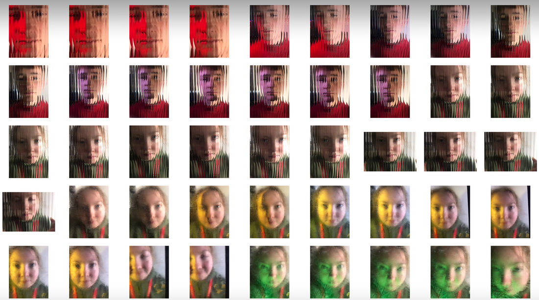
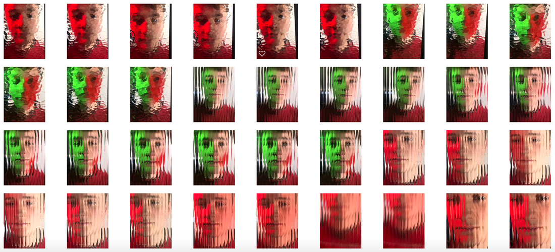
FINAL DEVELOPMENT- ABSTRACT PORTRAITS
For my final development, I will be developing the abstract portrait section (specifically Mads Perch).

|


|
To create my images, I used pictures in which I had projected shapes/light onto my models face. I then put two of the images together as layers on photoshop and used the rectangular marquee tool to cut strips of the top layer, revealing sections of the bottom layer.
I think that these images are effective because they overlap two images to make one, and portray different emotions too. I also thought that this technique resulted in images that look similar to the work of Erwin Blumenfeld, and responding to his work earlier in the course was enjoyable.
I think that these images are effective because they overlap two images to make one, and portray different emotions too. I also thought that this technique resulted in images that look similar to the work of Erwin Blumenfeld, and responding to his work earlier in the course was enjoyable.
